The original iPhone was released on June 29th, 2007. Although the iPhone was far from being the first mobile device, it did change the mobile landscape forever. Prior to the iPhone, using the Internet away from a desktop or laptop was limited to watered-down webpages that rendered as text. But because the iPhone included a full online browsing experience through Safari, it kicked off an explosion in the mobile web.
Mobile’s Evolution Over the Last 9 Years
While the mobile web as we know it today is less than a decade old, it’s already gone through several evolutions. The first was the app gold rush. In addition to the Safari browser, Apple also launched the idea of apps with their device. This led to developers and businesses rushing to create apps. However, it became clear that most people don’t want to use a dedicated app for every business they’re interested in. This is supported by recent research which shows that most people use less than a half dozen apps on a regular basis.
Since it doesn’t make sense for most small to medium businesses to have a dedicated app, there was also a time during the last nine years when the focus was on having a separate mobile website. The reason that the trend has come and gone is there were several major problems. Not only did it create an often frustrating experience for website visitors, but it also required businesses to manage two different websites.
Why Responsive Design is The Best Solution for Mobile
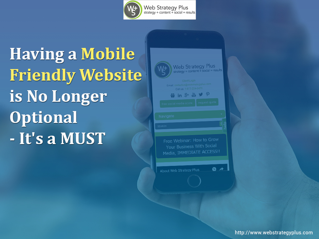
Multiple studies have confirmed that mobile is now the most common way that people of all ages search online and visit websites. So even though it doesn’t make sense for most businesses to have an app or separate mobile version of their website, having an optimized mobile presence is a MUST!
The option that has emerged as the best mobile solution for businesses is responsive website design. With this approach, a website will automatically resize to a screen of any size. That means a site will load quickly, look great and offer full functionality on any mobile device, tablet or standard computer. And unlike the previous approach of having two versions of a website, responsive design is done through one set of code, which makes it very easy to manage.
How do you know if your current website has an optimized responsive design and is fully mobile friendly? The best way is to use Google’s free mobile-friendly test tool.
What If You Don’t Pass the Mobile-Friendly Test?
If you don’t pass Google’s test, it almost guarantees that your site isn’t ranking as well as it should for mobile searches. It also means that visitors who do come to your site via a mobile device are more likely to abandon it due to a less than optimal experience.
Since those issues mean your business is missing out on potential revenue every day, you need to fix them as soon as possible. That’s where Web Strategy Plus can help. With our responsive web design services, we can fully update your site to ensure it’s completely mobile friendly.
To get your site’s mobile problem solved as soon as possible, contact us now for a free consultation and quote!
No comments:
Post a Comment